Answer the first three questions.
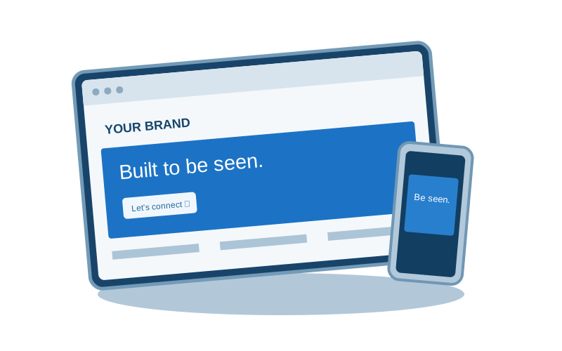
A visitor needs to understand what you do, who it is for, and what to do next. Your first screen should make those answers visible. A distinctive design creates interest; specific language helps a prospective client recognize that they are in the right place.
Give different audiences their own path.
If you offer several service lines, avoid asking one generic paragraph to explain everything. Create clear entry points, then give each audience the detail they need. A facility founder and a business owner shopping for a website may share your homepage, but they are making different decisions.
Use evidence with context.
Credibility comes from information a visitor can understand and verify: relevant experience, a clear process, specific services, and transparent scope. Use actual company facts. When results vary, explain the conditions rather than turning an anecdote into a universal promise.
Make inquiry feel manageable.
Ask for enough information to begin a useful conversation, and explain what happens after submission. A short, well-labeled form and a direct email option can make the process feel more approachable. Confirm success only when the submission has actually been accepted.
Test the whole journey.
Review the page on a narrow screen, navigate it with a keyboard, and open every important link. Make sure text remains readable when animation is reduced. The conversion path should still work when a decorative visual takes time to load.
Move from perspective to a plan.
Let’s connect these ideas to the business you’re building.
Start a conversation